Machine-Learning Introduction
This blog is pretty long and is intended to be a crash-course on a number of the main topics of machine-learning. To make the blog more manageable, I have broken it down into different chunks. This should also make it easier to navigate if you need to refer back to it later. Click on any of the chunks to show the content underneath and dive-in.
The list of topics is not exhuastive but I had to draw the line somewhere. I think I've covered the main topics in sufficient detail, but if there's anything signifcant you think is missing, please get in touch.
I have made efforts to make this blog mobile-friendly but some of the charts do contain a lot of detail and it can be hard to read on mobile. I think readers will get more out of the blog if they view it from a tablet or desktop device.
Finally - I hope you enjoy reading it as much as I enjoyed making it!
P.s. If you want to really consolidate your knowledge and understanding of machine-learning algorithms, I highly recommend writing a blog on them. I'm not sure I learnt anything new during this blog, but it has certainly helped me appreciate some of the more niche details in some of the topics that are covered.
Machine-Learning is the name given to a set of algorithms which are fed data as the input and which can then automatically work out how to get to the desired output. This is different from conventional techniques where the analyst is in full-control of the methods that convert inputs to outputs. Machine-learning models are commonly referred to as "black-boxes", where the inner-workings of the model are not always clear or obvious.
In our current era of big data and industry 4.0, we need solutions which can scale across many (often hundreds) of dimensions of data to produce an answer. Such problems are too big to be manually coded to ensure the output is correct, so instead we feed the input data into an algorithm, whose programming we understand, and let it develop the solution for this specific problem by itself.
Because the inner-workings of the model are not known, we cannot know that the results will be right. Therefore, we usually train the model and compare its results for a known set of inputs against a known set of outputs. The results are rarely 100% as expected, so it boils down to how much error can be tolerated, and what are the repercussions for incorrect results. Often, there are many different algorithms that can be used to achieve the same result, and different ways to tweak the various algorithms, meaning that choosing the best algorithm is often more of an artform, rather than direct science. Experience is key, which is why machine-learning engineers are in such high-demand.
However, given that the inner workings of a machine-learning model are not easily known, the use of such models in areas such as medicine or justice can pose ethical dilemmas. But since they are proving themselves to be more effective than conventional techniques, this makes the ethical question even more difficult as we want to achieve the best possible outcomes for such services, and anything less than the best is itself unethical. As the field of machine-learning develops, it will be interesting to see how such problems are approached by the relevant authorities.
The data used throughout is the classic "Iris" dataset. The Iris dataset is measurements of four features from three types of flower (Setosa, Virginica, and Veriscolor). The dataset used in this tutorial is imported from the sklearn.dataset.load_iris() function within Python.
I did want to use some real-world data from my FitBit but there are always caveats and post-processing, the details of which could have made this blog difficult to follow. Using a conventional dataset also has advantages, as you're likely to see the same data analysed in different ways on different sites, which should help to solidify any learning between different resources.
Plotting each of the features against each other, the following plot can be obtained.
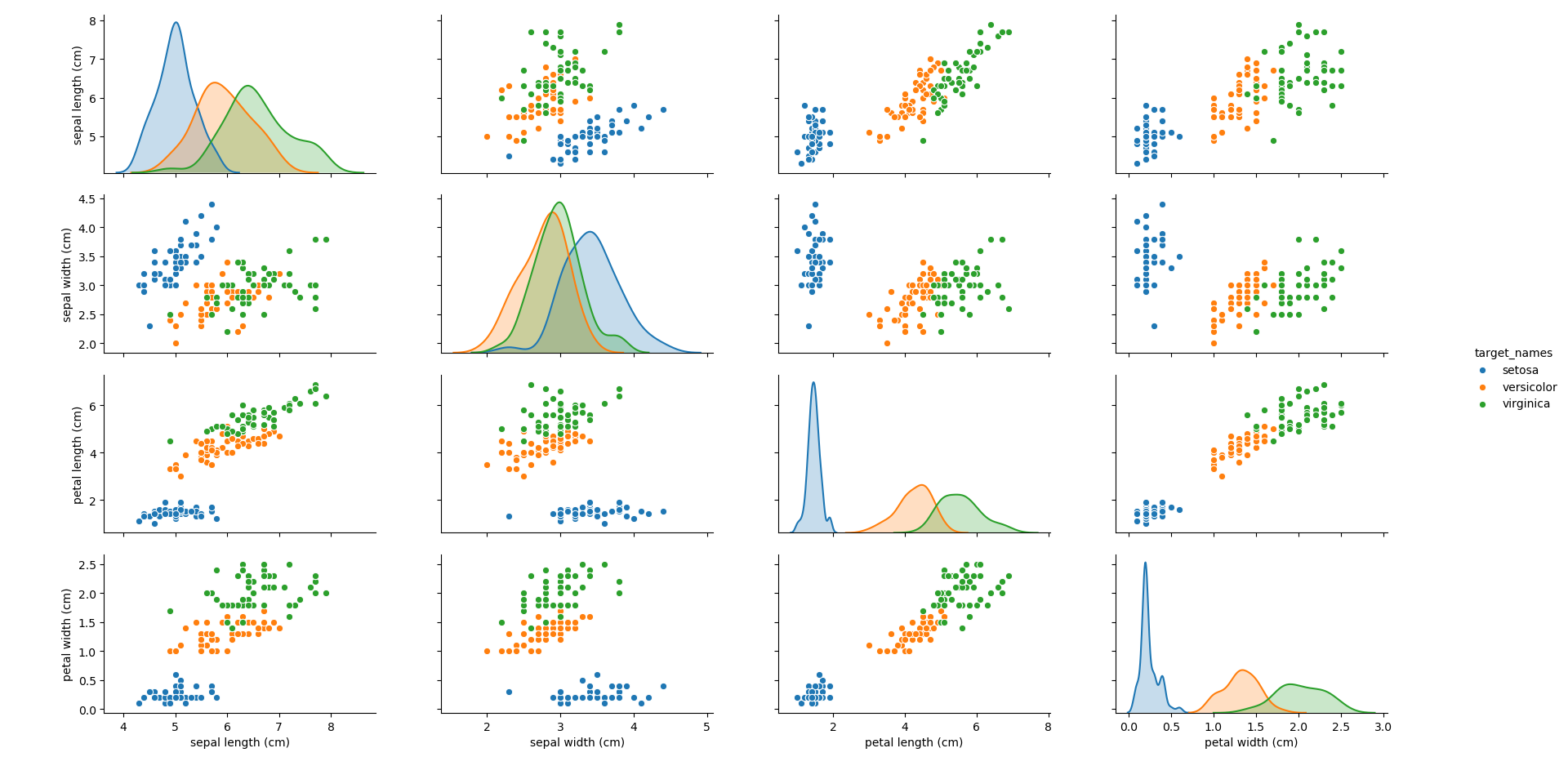
It can be seen that the blue group (Setosa) generally stands apart from the other two groups, making it simple to identify. However, depending on the feature, it can be seen that there can be overlap between the other two groups (Virginica and Versicolor). How different algorithms treat this overlap will be an interesting point to note throughout.
Note: Throughout this blog, the Petal Length and Petal Width have been used as the main features for use in the different algorithms. This is purely to make the data and algorithm results easier to visualise.
Clustering algorithms find groupings within the data that may not be obvious to the analyst e.g. perhaps there are a large number of dimensions in the data, meaning that manually visualising and inspecting each combination of dimensions becomes difficult. This is not uncommon in today's age of big-data, with more and more business measuring how their products are performing in every conceivable way.
Clustering is often confused with classification problems as they both refer to groups within a dataset. Clustering is the finding of different groupings, and classification is assigning individual data-points into groups. As such, it is very common to run a clustering analysis on a dataset, before later using a classification method to assign data-points into the groups identified by the clustering analysis.
Clustering algorithms are an example of unsupervised learning - that is, there are (usually) no pre-defined existing labels attached to them. Instead, the algorithm will attempt to identify different groups, but the labelling or rationale behind each grouping is for the analyst to decide. In our Iris dataset, we happen to know that there are three distinct groups but let's assume for now that we did not know that. How would we work out how many groups there are in our data? This is the problem that clustering algorithms try to solve.
Probably the most popular and simplest clustering method is the K-means algorithm. The analyst chooses a value for K (the number of groups in the dataset) and the algorithm randomly selects K centroid points within the feature-space. Every point is then assigned to the group of nearest centroid. When every point has been grouped, the centroid values are updated with the average (hence K-means) values of every point in the group. This update means that the nearest centroid may now be another group, so the algorithm re-assigns all groupings. It then re-updates the centroids, and re-updates the groupings, and so on until all centroids and groupings converge on final values, and no more updates are required.
Using the K-means algorithm for our dataset generates the results below. Note: For simplicity of visualisation, only the "petal length" and "petal width" features have been used (this feature-pair seems to have best potential for separation of each group, and plotting is much easier in two dimensions rather than four).
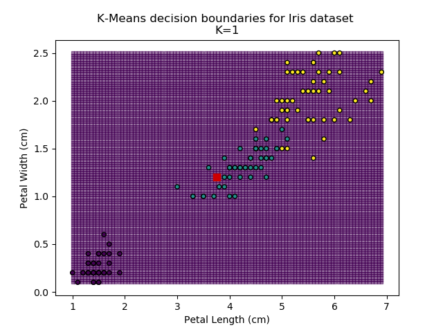
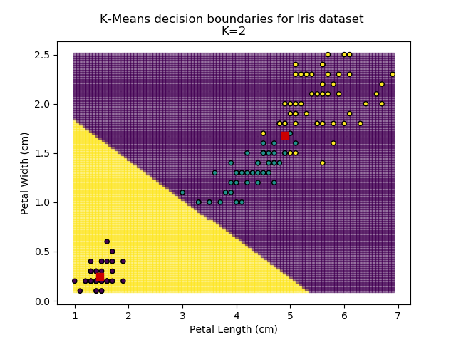
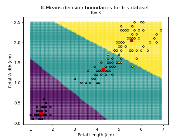
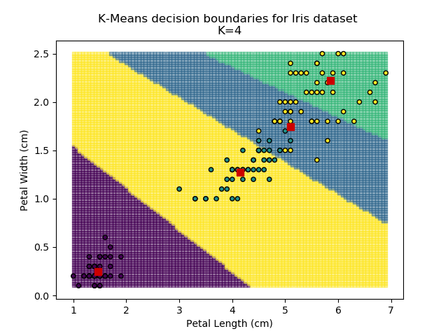
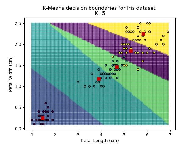
Note that in the charts above, the colouring of the background highlights which group a point would be assigned to, and the large red squares are the centroids of each group.
So how do we work out how many groups there are? For every instance of the K-Means modelling, we can calculate the average distance to the nearest centroid. For K=1, the average distance will be quite large, suggesting that we are using too few groups. However, for k=5, there are more centroids than we really need, so adding new groups isn't really improving our model. Therefore, we're looking for a sweet-spot somewhere in-between - where adding more groups is reducing the average distance significantly enough but before the diminishing returns sets in.
Plotting out this "average distance vs K" looks like below:
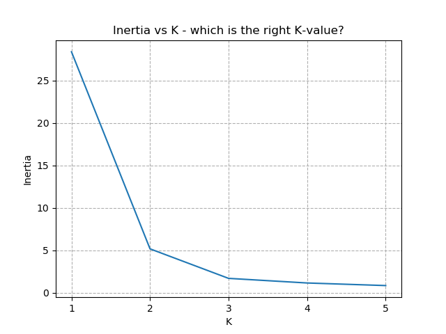
It is immediately clear that the biggest bang-for-buck reductions-per-K is between 2-3. Therefore, one of these values is the most appropriate for how to classify our data. Remember I said before that the Setosa group is simple to identify against the other two groups, and that Versicolor and Virginica show some overlap between features? That is exactly what we are seeing here - K=2 becomes "Setosa" and "Not Setosa", and K=3 identifies each group, but as Versicolor and Virginica have similar dimensions, the distance-reduction is less pronounced.
There is no hard-and-fast rule to follow for which K is best. It is always dependent on the data available, any associated caveats from sampling / measurement etc, and any existing hunches with the data. Typically, the "elbow" of the above chart indicates the most appropriate number for K. Exactly where the elbow is defined to be is subject to the problem, the data, and the experience of the analyst.
A hierarchical dendrogram works by looking at all of the individual points in the dataset and incrementally joining together the closest points into clusters, and calculating the 'entropy' of the system. Entropy should be thought of as the average distance between the original data-points and the centroids under the newly clustered system (similar to the K-Means inertia term). Initially, each data-point can be treated as its own cluster. Under these conditions, the entropy of the system is 0. As points are joined together, the entropy increases.
Dendrograms can be tricky to interpret at first. Here, the y-axis is the Entropy score, and the x-axis is each of our individual observations. Don't worry too much about the lowest entropy scores, where the plot is very busy - this has been shown just to make it clear what the dendrogram is plotting (I figured it might be tricky to understand if the plot was pruned to show only the higher levels).
But how is this useful? Taking a horizontal slice through the dendrogram shows the number of clusters required to keep entropy to within a certain level. However, in practice, we usually do not have an allowable level of entropy (it's not a meaningful value really). Instead, what is of most interest to us is the longer vertical lines. These lines indicate the grouping levels that have the biggest effect on entropy i.e. the most likely indicators of how many distinct groups are in the data. Once the dendrogram starts splitting rapidly into more groups for small changes in entropy, this indicates that these groups are not significant.
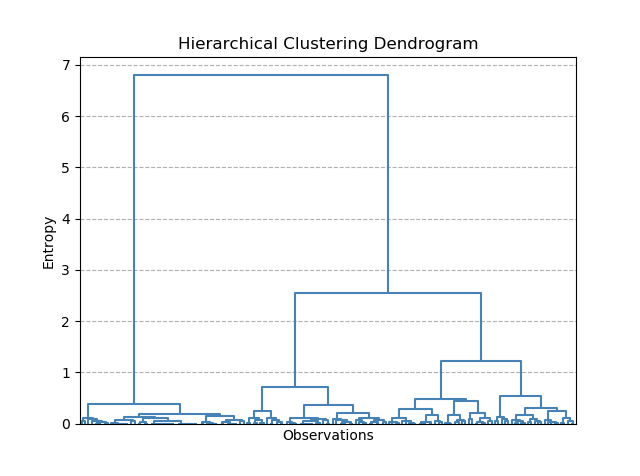
For our Iris dataset, it seems that splitting the data into 2 groups has the biggest impact on entropy. However, splitting into 3 also produces another large drop in entropy. This is exactly what we saw with K-means as well.
Classification algorithms solve the problem of working out which group a data-point belongs to. Whereas clustering was about discovering which groups may exist in the data, the groups are already known in classification problems. Hence, classification algorithms are an example of supervised learning.
In our Iris dataset, there are three groups - Setosa, Virginica and Versicolor. By looking at the values of the different features of the data (e.g. petal width and length), we should be able to work out which group any new points belong to. It turns out there are many different ways to approach this kind of problem, each with its own pros and cons.
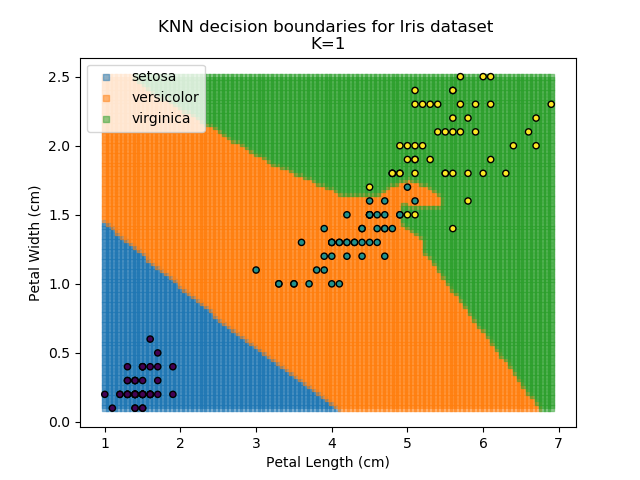
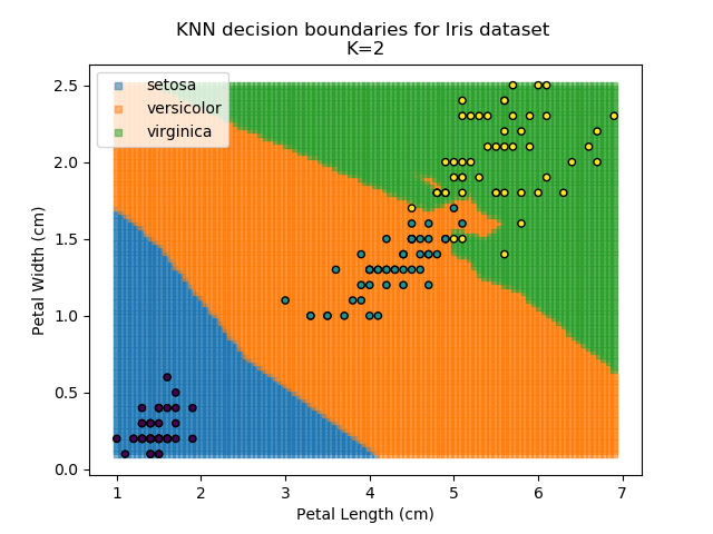
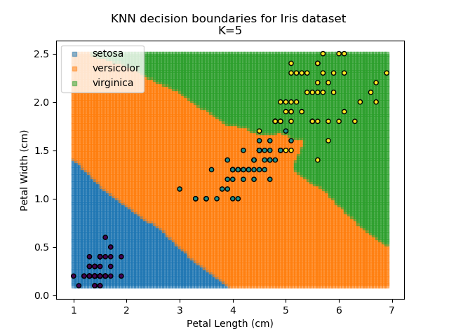
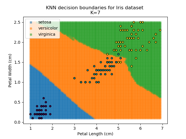
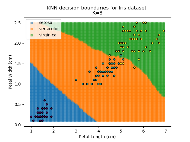
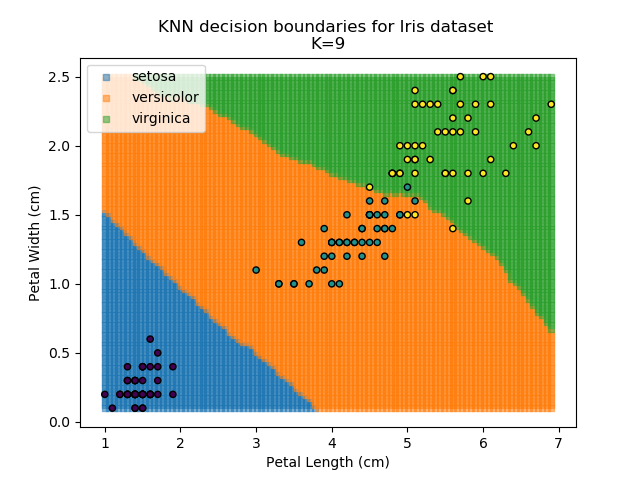
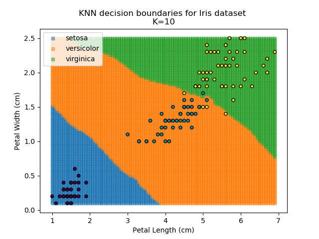
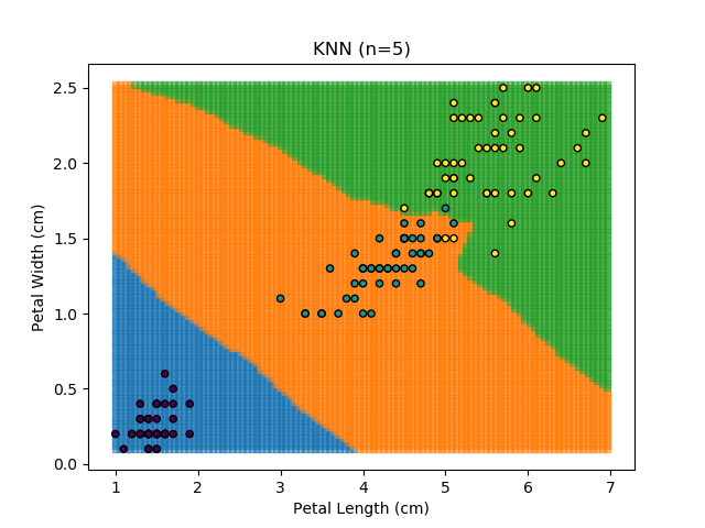
KNN is an acronym for "K-Nearest Neighbours". Similar to the K-Means algorithm for clustering, KNN is one of the more common and simpler techniques for classification problems. Its premise is pretty simple - for any given point, look at a number of the points closest to it (number = K) and assign the current point as the same class as the majority of these close points. In the event of a tie, additional weighting can be given based on the distance between the points.
I have actually covered KNN classifiers in more depth in a separate blog, which could be of interest.
Applying this classifier to our Iris dataset creates the results shown below:


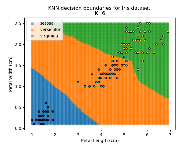
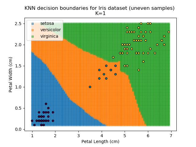
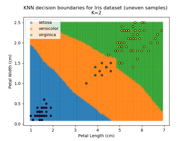
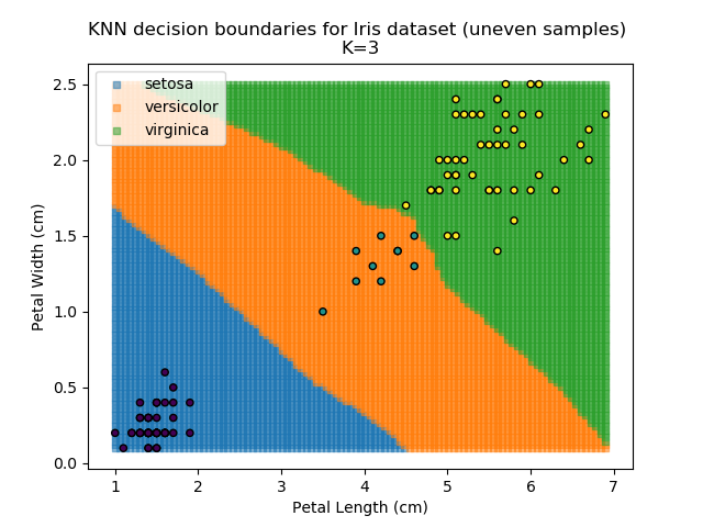
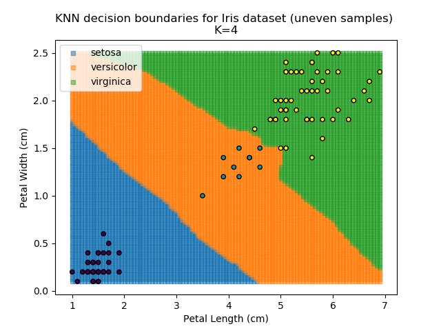
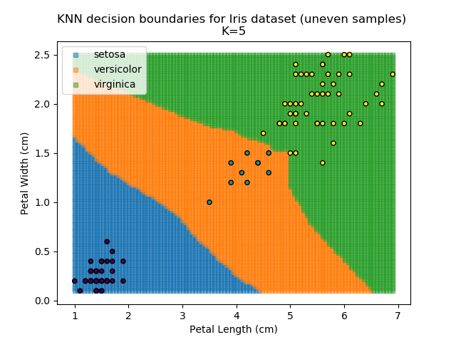
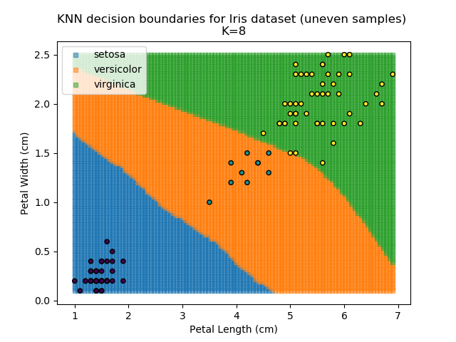
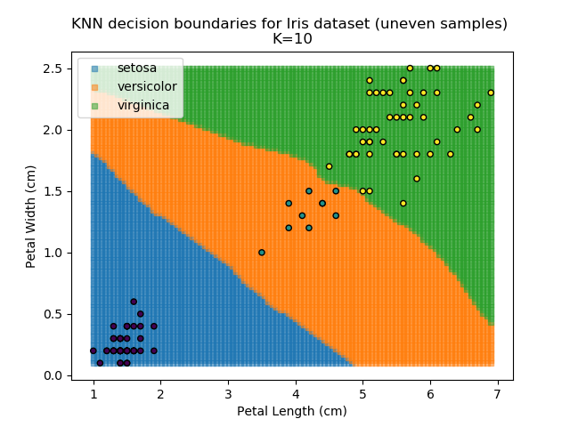
KNN is popular because of its simplicity and computational efficiency, and it scales quickly and easily to high-dimensional problems. However, it lacks real mathematical rigour, which can mean it performs poorly against some of the more sophisticated methods (SVM, for example). Furthermore, uneven sampling can really trip up the algorithm. Consider the example shown below. The input data has been modified such that the Versicolor group has only 20% of its original sample size, while the others have been left at 100%.
Note that the boundary between the versicolor and virginica groups is very different in both scenarios.


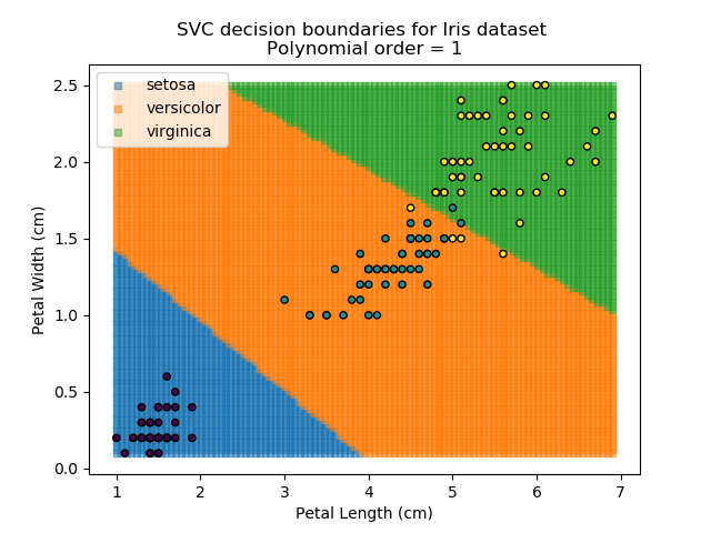
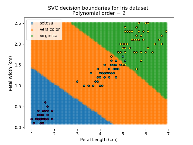
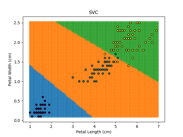
SVM stands for "Support Vector Machine", which is a very scary term for something that is actually a pretty simple concept. Essentially, SVM algorithms try to define mathematical boundaries between different groups in the data. The technical term for this is defining "hyperplanes" through the data. These sound exotic and they can be, but in practice, they are often be simple linear boundaries.
SVMs are popular because they work well in almost all scenarios, whether low- or high-dimensional data. Also, since they are rooted in continuous mathematical modelling, they tend to extrapolate better for new data than other algorithms. SVMs have a number of configurable parameters which can be tuned to be suit the problem at hand, making them very versatile. However, in higher-dimensional problems, they can be very computationally expensive, making them slow.
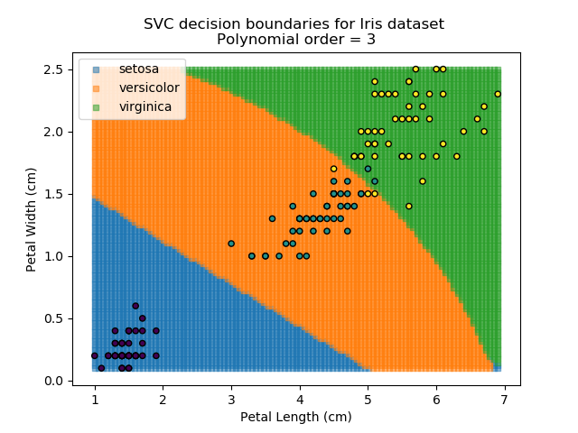
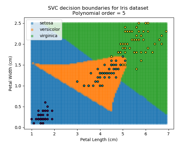
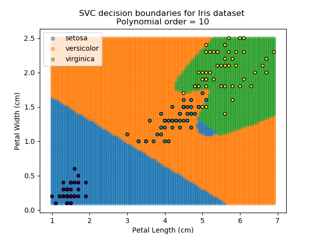
Applying an SVM classifier (usually abbreviated to SVC) to our data provides the results below. Note that all fitting has been done with polynomial functions of various orders. Orders 5 and 10 has been provided to show clear examples of over-fitting to the data. In reality, polynomial order 1 (i.e. linear boundaries) would probably suffice for this task.
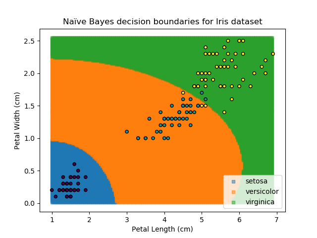
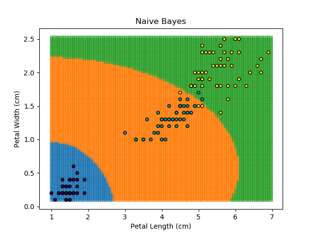
As the name might suggest, the Naïve Bayes classifier is based on Bayes' Theorem for conditional probabilities. The 'naïve' refers to the assumption within the model that all inputs are independent, when the reality is that this is usually not the case.
Loosely stated, Bayes' Theorem calculates the probability of achieving the current conditions given some knowledge of the system they are within. The classic example is usually testing for a disease within the population but given the state of the Covid-19 pandemic, that one feels far too close to home right now. Therefore I'll use the other common example.
Suppose a test for the presence of a drug is 99% accurate, and that 5% of the population are drug users. Sounds like the test would be pretty good at identifying drug users in the population, right? When we actually crunch the numbers however, it turns out that only ~85% of positive tests will be from genuine drug-users, and over 15% of positive results are false positives. This is the power of Bayes' Theorem. We will revisit this later when discussing confusion matrices.
The Naïve Bayes classifier works in a similar way. It asks "what is the probability of this point belonging to this group, given that it has these feature values?". The data-point is then assigned to the group with the highest probability. In order to calculate each of the probabilities, some information needs to be provided about how each of the features are distributed. Typically, the distributions are assumed to be Gaussian i.e. that they follow a Normal distribution.
The Naïve Bayes classifier is popular because it is computationally simple. However, its assumption of independent variables makes it less versatile than other methods.
Decision Trees are another popular classification method. They break down the task of classification into very simple logical steps each with Yes / No answers e.g. is Petal Width greater than 0.8cm? The classification for any given point is then worked out by just following the decision tree down all of its branches.
This approach generates classifications which are very accurate to the training dataset. After all, we can just keep splitting regions down further and further until each region accounts for a single data-point. It is because of this that decision trees are very prone to over-fitting.
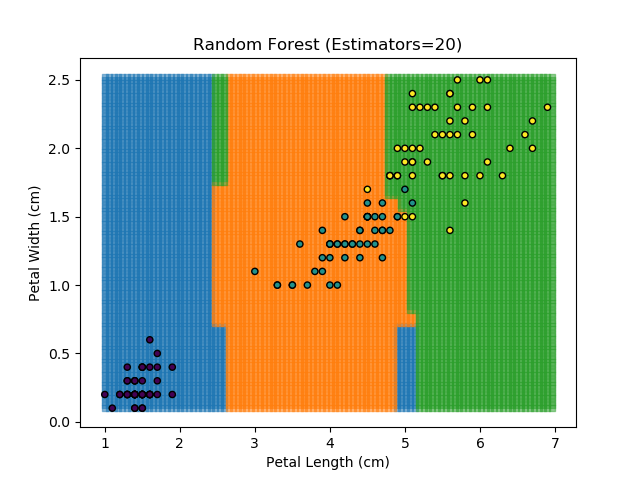
To prevent over-fitting, there are some things that we can do. One of the main ways to do this is to limit the length of any tree's branches. However, this can then lead to the opposite problem of under-fitting. But this is where a specific quirk of decision trees comes into its own. Rather than having a single tree that makes all of the decisions, we can instead generate many different trees and have each of the trees 'vote' on the final classification (the process of creating a decision tree has some randomness, so trees generated are not all similar). Because this approach makes use of a collection of trees, it is known as 'Random Forest'.
Random Forest classifiers are very popular because they are quick to run and generally quite robust. However, they can be slow to train and their accuracy and robustness is dependent on the skill of the analyst designing the Forest.
The results of some combinations of decision trees and random forests on our Iris dataset are shown below. Note that where # estimators = 1 indicates a single decision tree. Where # estimators > 1 indicates use of Random Forest.

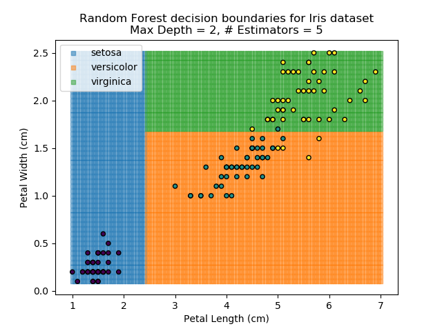
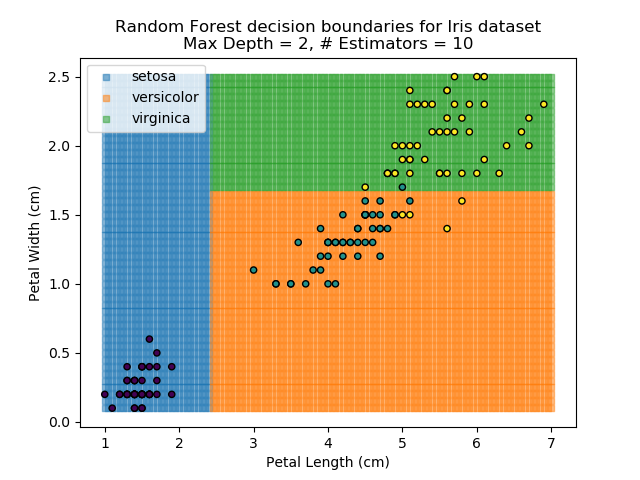
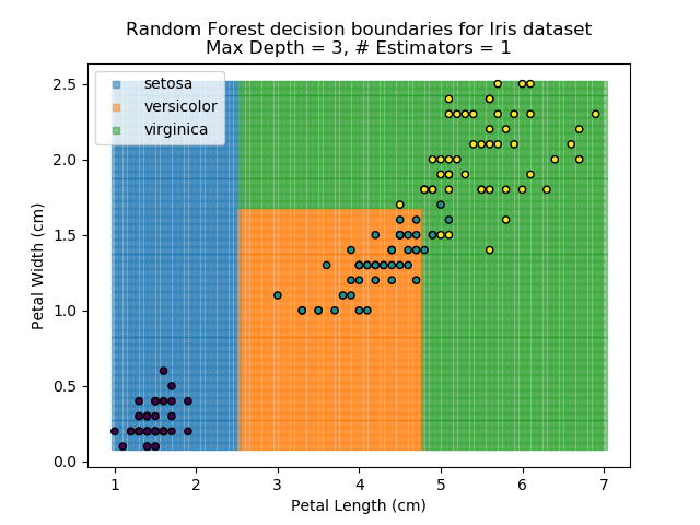

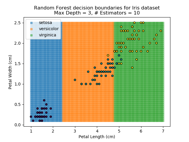
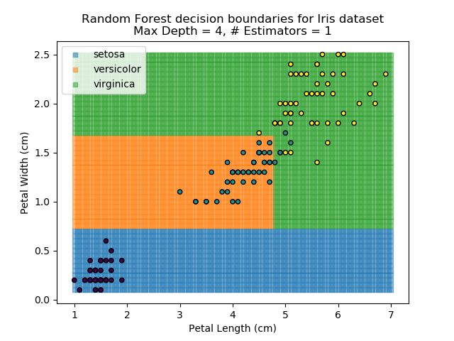
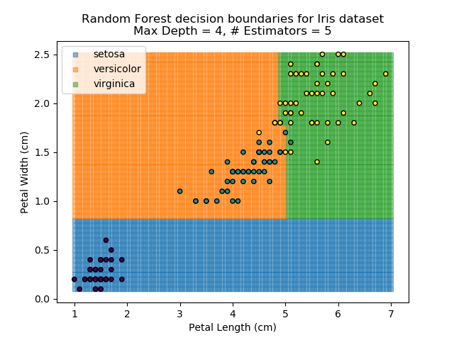
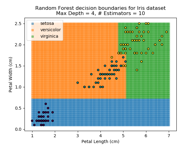
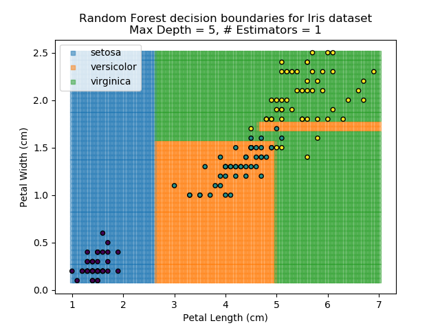
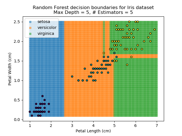
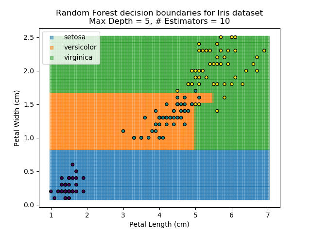
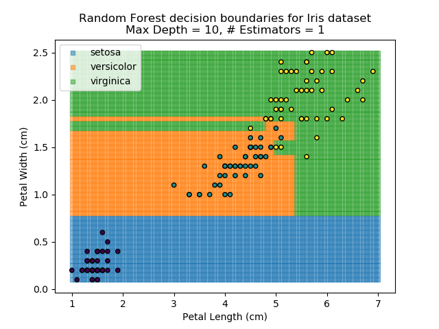
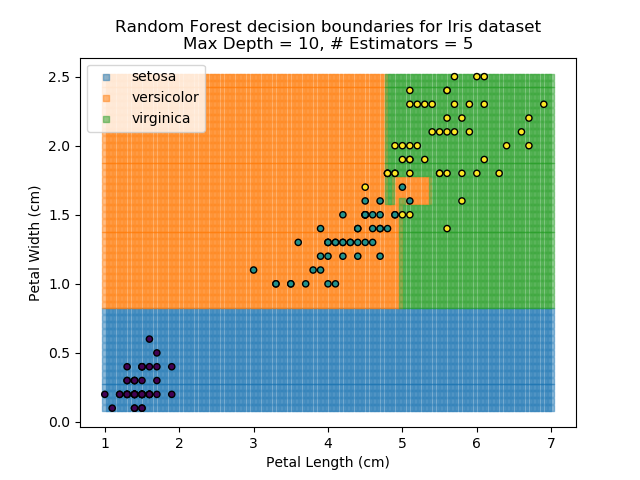
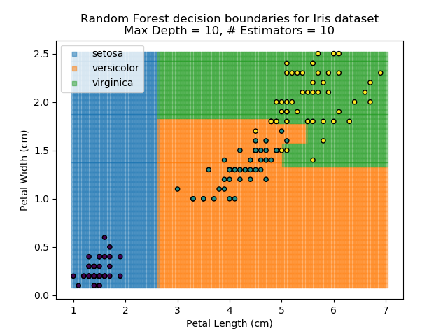
Note that as the max depth of each classifier increases, the more points are classified 'correctly', but it's clear that the algorithm is overfitting to the data. This is clear from the many corners in the small region where veriscolor and virginica overlap.
A Confusion Matrix is a way to check the quality of a classification algorithm. It is usually presented as a table, with all classes listed as both columns and rows of the table, and the cells in the table show how many data-points were assigned to the different classes. In a simple binary classification problem, there are 4 boxes - True Negative, True Positive, False Negative, and False Positive. A good classifier will maximise the number of True results and minimise the number of False results.
Going back to the drug-user example in the Bayes' Theorem section - we have a test that is 99% accurate when identifying users of a particular drug. It is known that drug-use is prevalent across 5% of the population. Application of Bayes' Theorem suggests that a lot of the positive results would actually be false positives. If we do the maths for a sample of 1,000 people, the confusion matrix would look like shown below:
| Test Result | |||
|---|---|---|---|
| Not-User | User | ||
| Actual | Not-User | 940 | 10 |
| User | 1 | 49 | |
So, even though the test is 99% accurate, we still end up with 16% of all positive results being false positives. This is because non-users make up a much more significant proportion of the population in the first place.
For multi-class problems, a confusion matrix lists all of the available classes as the rows and columns of a table. Ideally, every data-point would be classified correctly, so all of the entries in the confusion matrix would be along the leading diagonal, and zero everywhere else. But where points are identified incorrectly can help indicate where the classifier needs to be improved.
Using the KNN algorithm with k=10 from before, the confusion matrix looks like below (but first, a quick reminder of how the results of the classifier look):
Iris KNN Confusion Matrix
| Predicted Classes | ||||
|---|---|---|---|---|
| Setosa | Virginica | Versicolor | ||
| Actual Classes | Setosa | 50 | 0 | 0 |
| Virginica | 0 | 49 | 4 | |
| Versicolor | 0 | 1 | 46 | |
So, it seems our KNN classifier is working well for the Setosa group - all Setosas were classified correctly, and none of the other classes are mistaken as Setosa. However, it seems that the boundaries between Versicolor and Virginica are a little more tricky, with 5 points incorrectly classified. Of those 5 points, 4 of them are Virginicas incorrectly classified as Versicolors. This then is an area where our classifier could be improved.
One way to improve the classifier would be to use a range of different classifiers in conjunction with each other and have each of them 'vote' on the final outcome (similar to Random Forest technique). The weights of each 'vote' can be calibrated to give better predictors (from the training data) a stronger vote than the techniques which showed to be less robust during training. This technique of using multiple models working together is called an ensemble approach, which we will cover later.
Regression is the act of generating a function or model that estimates an output quantity based on the values of the inputs. Whereas we have mainly looked at clustering and classification algorithms before now, regression is a separate technique. Those approaches may tell you which group a data-point belongs to*, but it won't help you quantitatively estimate a value based on other known features. To estimate that quantity, we need to use regression.
* Disclaimer: A lot of classification techniques do actually have regression equivalents whereby the classification technique is used to identify the data to use as inputs, and the output value is calculated from these identified points (usually an arithmetic mean or small-scale regression).
Regression is also known as curve-fitting. It is the method by which a line of best fit is placed through the existing data. The line does not need to be straight, it can instead be a curve. In fact, there is a bit of an art to deciding the form of the curve to fit through the data - polynomial, exponential, combinations of functions etc. Regardless of the form of the equation, the solution to calculate the best fitting parameters are fundamentally an optimisation* problem.
Generic optimisation is covered in more detail in a later section.
The best fit is usually the one which minimises the distance between the individual data-points and the fitted line. Typically, Ordinary Least-Squares is used as the optimisation parameter. For every data-point, the difference between the data-point and the fit is calculated. This distance is then squared (to more heavily penalise points which are far away from the fit) and summed across all points. This Sum of Squared Residuals (SSR) is the quantity that we want to minimise and by doing so, we produce the best fit through our data.
Another popular optimisation parameter is the Root Mean-Squared Error (RMSE), which is just the square-root of the SSR dividied by N-points. However, the RMSE value is more indicative of actual error when predicting, and is therefore more intuitive that the SSR (which is generally much larger than the original data). As such, RMSE is becoming more popular than SSR, but the two values are very closely linked.
Right, let's move away from the theory and return to our Iris dataset. From all of the charts shown, it is clear that *generally*, the greater the petal length, the greater the petal width. There is a relationship between the two values. Therefore, if we know the petal length, we can predict the petal width.
The images below show three different fits. The first is the optimised fit, which is a good fit through the data. The other two are poor fits through the data.
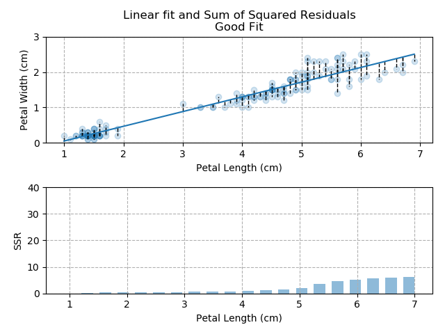
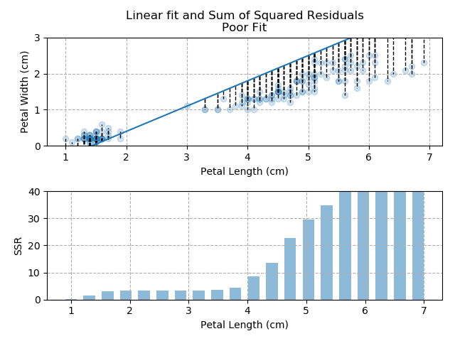
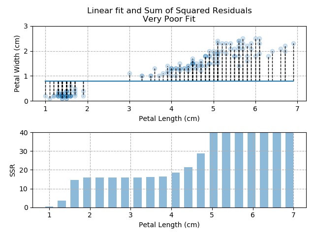
So - because the "good" fit keeps the SSR to a minimum level, it is the bets available fit for our data.
Note how quickly the accumulation of squared residuals increases for the poorer fits. They actually have SSRs greater than 70 but I couldn't make the axis limits that tall without them looking negligible for the optimised fit.
As for how the optimising is actually done - there is a step-by-step curve-fitting demo later within the optimisation section, if interested.
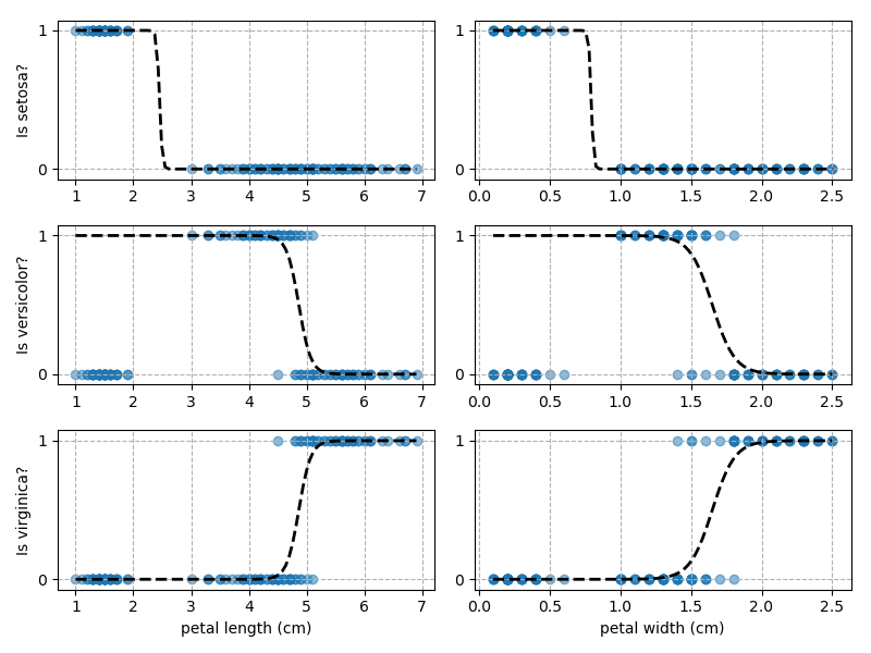
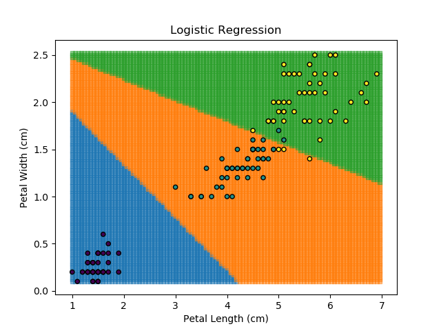
Logistic regression is a special implementation of standard regression techniques where the output is predicted between the values 0 and 1 (i.e. True or False). It is most commonly used in classification tasks. The general regression / optimisation process is unchanged, but the response that is fitted is typically the sigmoid function.
Why wouldn't we just use a classification algorithm? We could, but logistic regression has the added advantage of being able to calculate an actual probability, rather than just returning the final classification. The assigned class is then the result with the highest probability.
Right then - onto applying this to our Iris dataset. Using petal length and width as independent predictors, we can calculate the probability of any given point being whichever of the 3 classes. Remember: logistic regression is a binary classifier, meaning it can only work between two individual classes. Therefore, we need to run the regression twice for each point - once to determine whether it is Setosa / Not Setosa, and again to determine if it is Virginica / Versicolor.
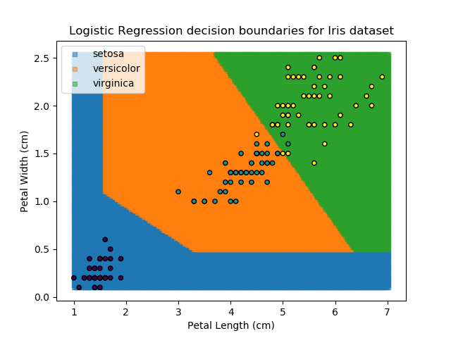
Applying this to our whole dataset produces the following classifications:
And if we wanted to know the probability of any point for any of our three classifications:
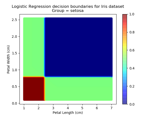
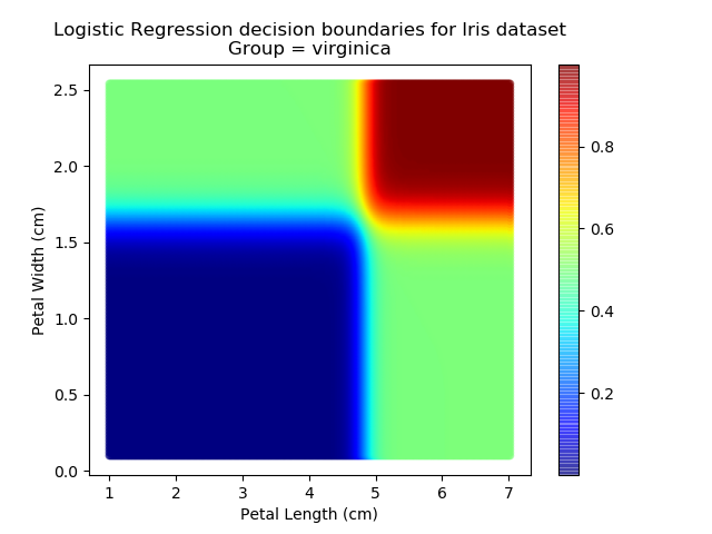
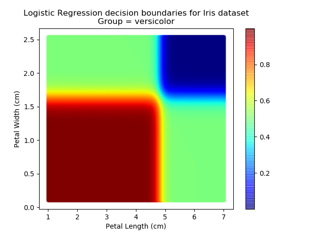
Eagle-eyed readers may spot that there are large red sections in the bottom-left of the chart for both Setosa and Versicolor classes, so how does it know which classification to recommend? Well, remember that logistic regression is binary and that we have had to sequence the steps to produce a three-group classifier. Based on the sequencing given, this model gives priority to anything that it believes is a Setosa class. This also explains the long blue perimeters on the full classification chart.
The train/test split is where the available data is split into (usually) two distinct sets - one for training our model and one for testing it. At first, it might seem strange not to use all available data for training the data - surely that gives us the best fit, right? But if we do that, then we are likely to overfit to our data. Worse still, if we use all of our data for training, we will have no fresh data to test our model against to see how it behaves on unseen data. After all, that is why we train the model - to use it to create predictions on unseen data.
Note: it is important that the sampling scheme used to split the training and testing data is free of systemic bias. Typically, this is done by randomising the data when splitting. However, for time-series data where sequencing may be important, the analyst needs to decide how to fairly split their training and testing samples.
Some analysts also use what they call the "validation" dataset, which is another subset of the data. This is effectively another "test" sample to check the model's performance against unseen data. A validation dataset is most commonly used when the final model has been selected based on the results of the initial "test" dataset, and we then need another sample of unseen data to validate the model's performance.
There is no hard-and-fast rule to decide what proportion to use for testing and training, but it's usually the case that around 70-90% of the available data is reserved for training, and the rest for testing. There are special-cases however. For example, one instance I have come across is where running the analysis method is very computationally expensive and took a lot of time to run. In this case, I would iteratively train against 5% of the data and test (infrequently) against 95%. It is the analyst's job to decide which strategy is most appropriate for the task at-hand (one more reason why humans won't be replaced by total automation just yet).
K-Fold cross-validation is a clever way to partition a dataset into multiple train- and test-sets. In K-Fold cross-validation, the data is partitioned into N different sets, and each set is used separately as a test dataset. For each iteration with a different test dataset, the training dataset consists of all other partitions. It might be easier to explain with an example.
Suppose our dataset is split into 5 partitions - 1, 2, 3, 4, 5.
K-Fold cross validation would then perform 5 different training iterations:
- Sets 1,2,3,4 used for training, set 5 used for testing.
- Sets 1,2,3,5 used for training, set 4 used for testing.
- Sets 1,2,4,5 used for training, set 3 used for testing.
- Sets 1,3,4,5 used for training, set 2 used for testing.
- Sets 2,3,4,5 used for training, set 1 used for testing.
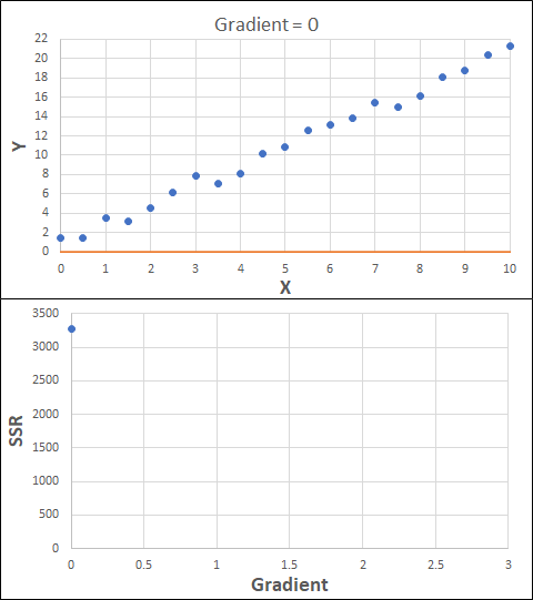
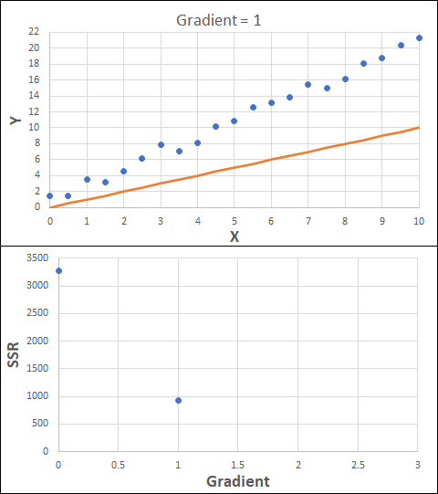
Optimisation is the act of finding a minimum or maximum of a quantity by changing the inputs. A common example of this is in regression, where optimisation is used to find the minimum of an error-function (usually Sum of Squared-Residuals) which compares the fitted data against the measured data. From calculus, the minimum of a function is where the gradient equals 0. Therefore, our optimisation approach should be iterating to find the value where the gradient of the error function is 0, or very close to 0.
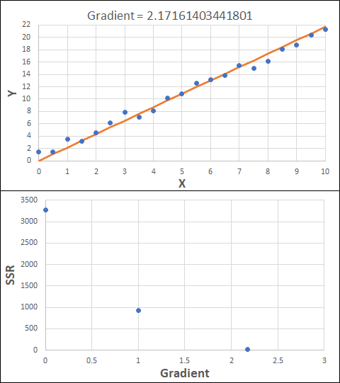
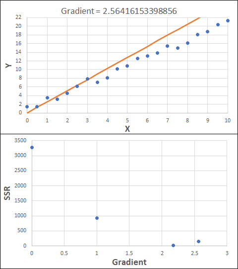
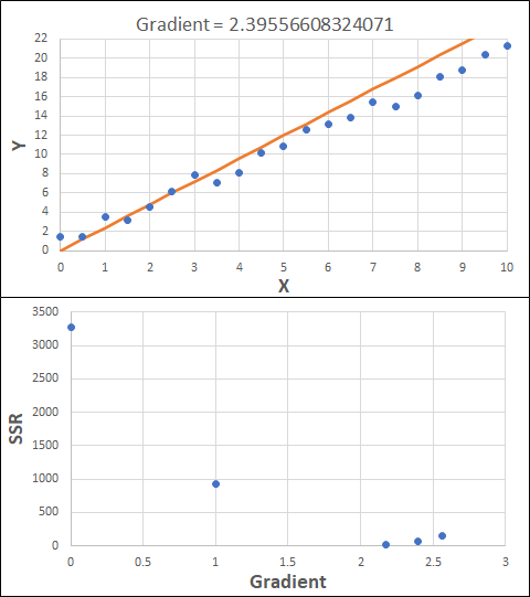
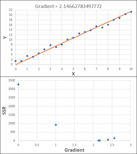
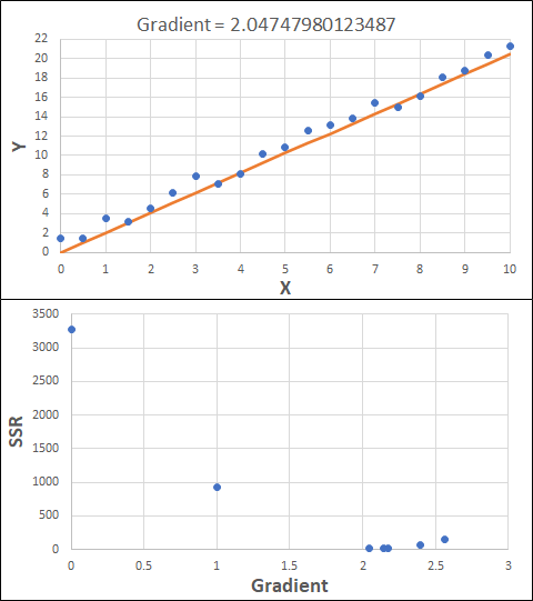
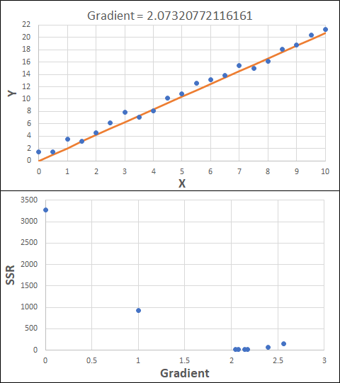
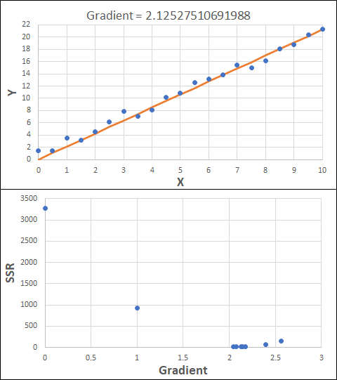
Consider the example shown below. The original data is just the line y = 2x, with some noise added. The spreadsheet has been configured to calculate the Sum of Squared Residuals (SSR) as the error-function. The optimisation algorithm is going to iterate to find the value of the gradient which minimises the SSR.
Typically, this minimisation is done using a Gradient Descent approach. Trending our error-function with respect to the variable(s) that affect it, we calculate the gradient and then work out the next iteration variable value by combining the gradient with the Learning Rate. The reason for this is simple - the larger the gradient, the further we are from our minimum value and therefore the larger the step we need to take. Conversely, the smaller the gradient, the closer we are to the minimum and the smaller the step we need to take. The most appropriate learning rate can vary but typically is around 0.01 - 0.0001.
The process is shown below. We are assuming the learning-rate is 0.0005. Note also that, purely due to the noise in the dataset, the optimal gradient value is actually 2.13, rather than 2.00.
Note that, in the real world, a lot of optimisation algorithms specifically find the minimum value of a function. Therefore, if we want to maximise a quantity, we need to ensure the error-function is multiplied by -1.
Note also that an inappropriate learning-rate may not lead to convergence at all. It could easily lead to divergence, where the error function increases in ever-larger steps. This divergence generally happens when the learning rate is too large. Too small a learning rate can result in the algorithm taking longer to converge.
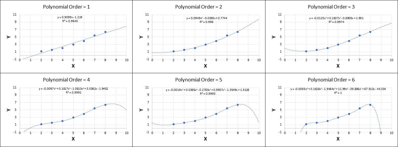
Overfitting and underfitting are both examples of poor modelling. Underfitting refers to situations when the model is not complex enough to capture the behaviour of the system e.g. if y is proportional to x3, but the fit applied is linear. Conversely, overfitting refers to when the model is too complex for the system. It then uses its remaining degrees of freedom to fit to the scatter in the data - which is undesirable. Both forms result in a model with poor predictive capabilities.
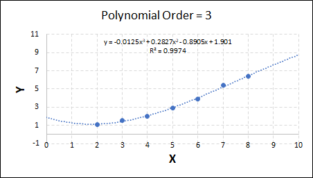
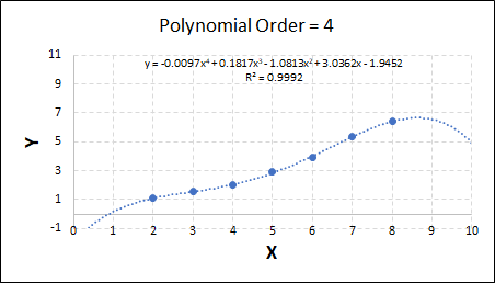
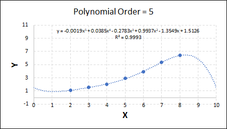
Consider the plots shown below. The original data is calculated using 0.1 * x2 with some noise added.
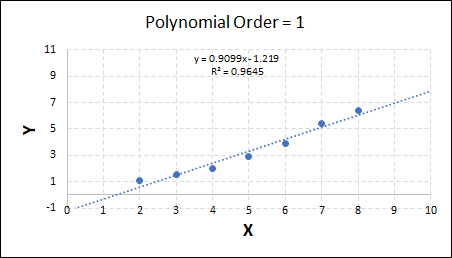
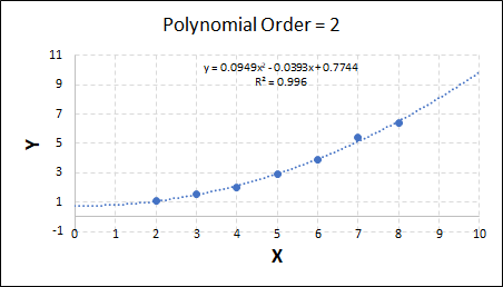
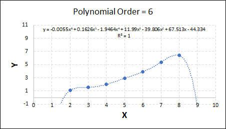
Note that when the polynomial order = 1 (i.e. a linear model), the r2 value is lower than any of the other models. Also, given that we know the function is proportional to x2, the extrapolation capability of this linear model is very poor. That the model predicts well across the interpolation range is purely because I limited the range of the data for illustrative purposes in this example.
As the order increases, the model becomes more accurate and the r2 value increases. However, as the order increases further still, above 3, it can be seen that the increases in r2 are small, and the extrapolation capbility of the model becomes extremely poor. These are clear signs that the model is overfitting to the data.
Regularisation is a technique which attempts to prevent overfitting within a model. It is known that if we add more and more terms to a model, we will improve its accuracy against the training data-points even if the relationship between the output and the input is not real. Regularisation attempts to mitigate this by penalising a model for having more terms.
There are two main types of regularisation used, which are explained below. Typically, the regularisation is applied as an addition to the error-function when fitting the model, along with a lambda parameter to give the regularisation technique appropriate scale relative to the standard error-function.
- Ridge - The model is penalised based on the squared size of each of the fitting coefficients.
- Lasso - The model is penalised based on the absolute size of each of the fitting coefficients.
Both methods penalise the model for having unnecessary terms but the results can be quite different. For example: Ridge regularisation is going to penalise the model more for having any large terms, however this may actually be appropriate - that one single term dominates the response. Conversely, Lasso regularisation is going to penalise the model more for having multiple terms with similar weights but again, depending on the problem at hand, this might be appropriate.
Using the data from the section on overfitting / underfitting, we can calculate the Lasso and Ridge regularisation function values.
| Order | R2 | Ridge | Lasso |
|---|---|---|---|
| 1 | 0.9645 | 2.31 | 2.13 |
| 2 | 0.9960 | 0.61 | 0.91 |
| 3 | 0.9974 | 4.49 | 3.09 |
| 4 | 0.9992 | 14.20 | 6.25 |
| 5 | 0.9993 | 5.19 | 4.18 |
| 6 | 1.000 | 8255 | 165.8 |
It can be seen that the fit which provides the largest R2 and lowest Ridge / Lasso regularisation values is the fit with x2 - exactly as would be expected. Note however that the answer is rarely as obvious as it is here. Yet again, it is the responsibility of the analyst to tune the model for the most appropriate fit for their given task.
There is another form of regularisation known as Elastic Net, which combines both of the Lasso and Ridge regularisation techniques. Elastic Net is generally more robust than either of the other regularisation techniques used in isolation as it suffers less from the specific limitations of each technique. Whichever regularisation approach is more appropriate depends entirely upon the problem at-hand and, once-again, it is the analyst's job to recognise this and apply the appropriate technique.
In big-data machine-learning tasks, it can often be the case that there are hundreds of features in a dataset which we may want to use to train our model. However, it is often the case that some of these features will be correlated. As an example, consider the Iris dataset that we have been working with throughout this blog - the Petal Width and Petal Length are correlated; a bigger petal width generally indicates a bigger petal length, and vice-versa. Therefore, in theory if nothing else, a similar amount of information can be represented with just one variable rather than keeping both variables. There will obviously be some loss of information, but the model fitting could be twice as fast if it only has to train on half the number of variables.
In these cases, we can apply dimensionality reduction to reduce the number of features in the dataset. The standard dimensionality reduction algorithm is known as Principal Component Analysis. As the name suggests, it works out the "Principal Components" of the data (which contain most of the information). It does this by fitting "hyperplanes" (mathematical functions) which contain most of the information in the dataset, and therefore the rest of the information becomes much less meaningful, and can often be discarded without significantly affecting the quality of the modelling.
Similar to clustering algorithms earlier, the best way to know how many principal components to include in our model is to fit across a range of values and search for the "elbow" in the chart. In our Iris dataset, there are only really two features in the data, and even those two are highly correlated. Therefore, I would expect that most of the information in the dataset can be represented with one principal component. Let's have a look:
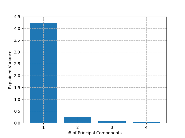
As suspected, the first principal component accounts for about 90% of all variance in the dataset. In theory then, we could train all of our classification and regression models on this decomposed dataset without losing too much accuracy, and they would be much faster to train and predict. However, in this case, we have only 150 data-points and 4 features so any performance gains are negligible in a real-world context. For certain applications e.g. image-classification, which may have millions of inputs, these gains could be significant. It won't surprise you to learn that, once again, any techniques employed and associated gains / losses are for the analyst to decide.
Note: it is very important to remember that the decomposed dataset has no physical meaning. It cannot be assumed that more of a transformed quantity = more of the output value, even if that is what a chart suggests. It is entirely possible that the fitted hyperplanes curve back around on themselves, so a higher component value may actually represent less of a given quantity in some areas of the chart, while representing more of *the same quantity* in other areas of the chart. For interpolation and extrapolation, the original data must be transformed with the same dimensionality-reduction model, then estimated, and the de-transformed to produce a viable result.
Ensemble Learning refers to the technique of training multiple models and having each of them "vote" on the final answer. This approach is actually the backbone of the Random Forest classification algorithm outlined earlier. Each model can be given different weights, which can be modified based on the training dataset to give the best results.
As an example, let's look at each of the classification models from the earlier section (KNN, SVM, Naïve Bayes, and Random Forest). Let's combine all of those models together to generate final classifications for each point in the dataset.
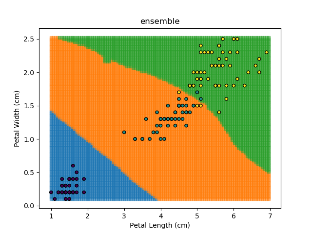
The ensemble approach however isn't a silver bullet that magically takes all of the good bits of the best classifiers. It takes advantage of a technique known as 'Bagging' (bootstrap aggregation) which shows that combining multiple weak classifiers can end up with a single good classifier.
In the real world, there may be a number of reasons for why to use / not use any given model. Therefore, including such invalid models within the ensemble approach will only make it worse. In practice, ensemble is generally used with different variants of valid models e.g. combining short-term, mid-term and longer-term modelling predictions.
Conclusion
And that's it, that's all for now! There is a lot in here, and don't worry about knowing / remembering all of the content - I wouldn't expect anybody outside of the world of data-science fully understand it all.
I hope this blog can serve as a useful reference point for people learning data-science, or to supplement those who want a new point of view on certain topics.